<style>
.outer h1 {
 text-align: center;
 margin-top: 0.6in;
 margin-bottom: -0.4in;
}
caption {
 margin-top: 0px;
 margin-bottom: 2px;
 padding-top: 0in;
 padding-bottom: 0in;
 font-size: 23pt;
}
.caption {
 margin-top: -2px;
 margin-bottom: 2px;
 padding-top: 0in;
 padding-bottom: 0in;
 font-size: 23pt;
}
.main p {
 padding-top: 0%;
 text-align: center;
}
.main_pic {
 margin-top: -1in;
 display: inline-block;
 text-align: center;
}
</style>EGU23 so far
While I am sitting at #EGU23 I am happy to be surrounded by so many scientists who care about the environment and are willing to go beyond their own topics to engage with the public and understand the ways we can work together towards a common goal.
I am delighted to also find a small but hopefully growing community of software developers and research software engineers around, fully passionate about FAIR principles and open science.
Two and a half more days are left and I have learned so much from different topics that I will probably need a couple of weeks to let everything sink in.
Posters@EGU23
Walking through the poster sessions is quite inspiring and I am glad to see several people taking up on the #betterposter initiative by Mike Morrison (@mikemorrison).
I tried this template myself this year for my poster contribution this year and of course I used R for it. For this I turned to posterdown by Brent Thorne (@wbrentthorne).
The package uses rmarkdown to create your poster, helping you to go seamlessly from your documented work or article draft, to different poster templates.
I enjoyed the flexibility you have with the package to display your results, and how it could be a great way to present interactive content for example at the PICO sessions at #EGU23 since the output from posterdown is an HTML document.
I will not go through how to create a poster using the package, since the documentation has quite some information that will help you create your own #betterposter, but I will list a couple of tips that turned out useful for my poster building.
Tip #1
Avoid headaches, use Google Fonts.
I had a really cool font installed locally and I wanted to use it for my poster. Result: error during rendering.
posterdown uses Chrome or Chromium for rendering, and using fonts that are not available on the web can be a hassle.
If you still want to use your very cool font, a good option is to look for it at similarfont.io, which can give you some ideas of alternative Google Fonts.
Tip #2
Want to adapt the
<style>, go thorugh the HTML templates.
Once I was on the final steps of my poster development, I wanted to change this little details like padding around titles, font sizes, and so on.
Some of these could be set on the file YAML, but others not. Also if you change from the posterdown::posterdown_betterport to posterdown::posterdown_betterland, some variables might not be named the same accross those.
What saved me some time was going through the HTML templates on the posterdown repo. For example, find the one for the better landscape template here.
Going through the template will reveal to you if what you want to change is a YAML parameter, most likely when the line starts with $if(parameter_name).
If it is not a YAML parameter, you can add an HTML chunk to your RMarkdown file that will hopefully override the settings you want (it does not always work or I lack the HTML/CSS knowledge to figure out why!)
This are the HTML changes I made to my poster:
Tip #3
Using
tmapto show results? Take some shortcuts when designing
tmap by Martijn Tennekes (@MartijnTennekes) is an excellent package to generate beautiful maps, especially if you want to combine raster and vector data.
But, designing your figure might be hard when you want to add legends, or distinct elements and you suddenly have white space all around.
This can become specially frustrating when the space in your poster is not infinite. Version 4 for tmap is soon coming, but in the meantime I still use the CRAN version to build my plots. I find tmap::tm_add_legend() and tmap::tmap_arrange() excellent functions to work around design issues, and one shortcut I usually take is to build my legend separate from the map, so that I can work with the space in an easier way.
But, problem incoming! When I tried to print two different figures in RMarkdown, i.e. the actual plot and the legend in a single code chunk, the figure width and height was used for both figures, without options to provide different heights.
Result? I had a very big white space below my legend.
Solution? Use two code chunks! This will allow you to give different dimensions to each output. If you need to add a figure caption, do it on the second plot, and to avoid an empty line between two figures, place your code chunks completely together, with no line break:
```{r}
#| label: figure
#| fig-width: 10
#| fig-height: 10
#| crop: true
library(tmap)
tm1 = tm_shape(data) +
  tm_polygons()
tm2 = tm_shape(data) +
  tm_polygons()
tmap_arrange(tm1, tm2)
#| label: legend
#| fig-width: 10
#| fig-height: 1
#| fig-cap: "Your figure caption."
#| crop: true
tm_shape(data) +
tm_polygons(legend.show = FALSE) +
tm_add_legend()```
The final product!
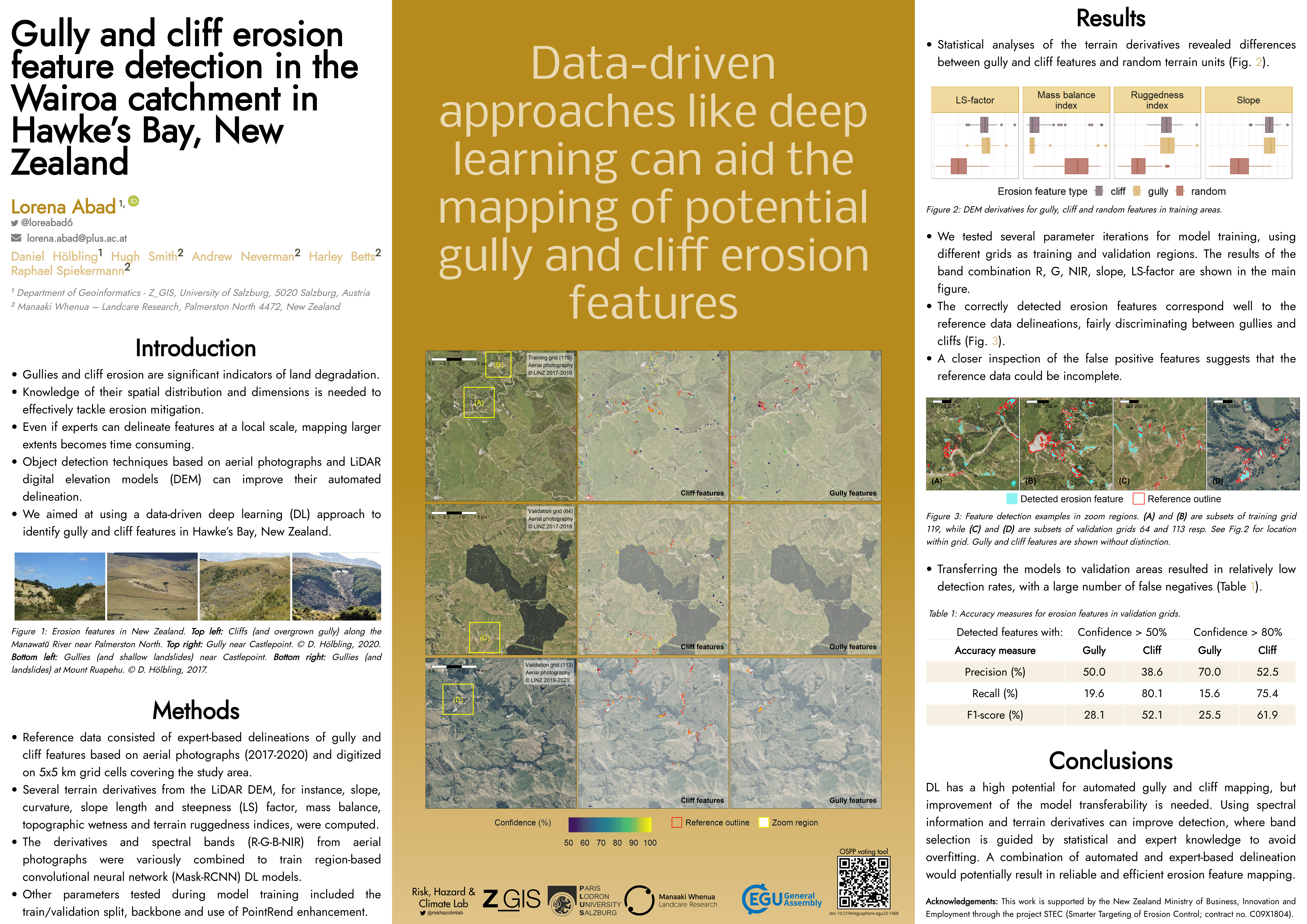
And here it is, the final poster at EGU! This is my first poster and I am happy to have found some interesting tools to come up with a nice result using R!

Reuse
Citation
@online{abad2023,
  author = {Abad, Lorena},
  title = {\#Betterposter at {EGU} 2023},
  date = {2023-04-26},
  langid = {en}
}