2 Tidy (spatial) data
In this session you should learn:
2.1 Installing packages
Last session, we mostly worked with base R. In this session we will be using dedicated packages that are particularly helpful for data science and spatial analysis.
Stable packages are usually installed from CRAN. The function install.packages() takes a vector of names and a destination library, downloads the packages from the repositories and installs them.
You can also install packages not on CRAN or “development” versions of packages using the {remotes} R package. Packages from GitHub, GitLab, Bitbucket as well as local packages are supported.
2.2 Tidy data
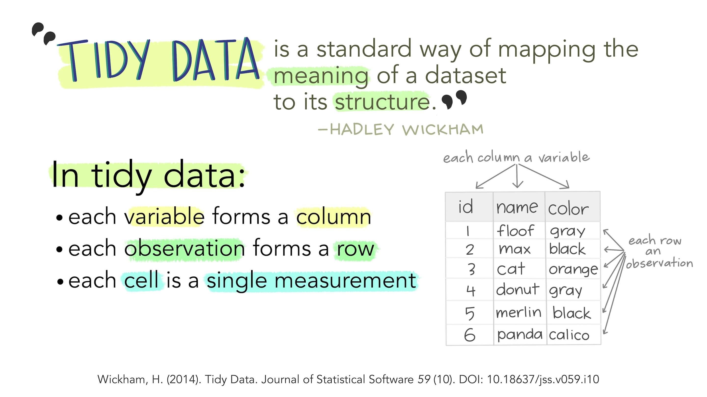
TIdy data is data organised in a particular, rectangular structure with one observation per row and one variable per column (Wickham, 2014).
Does this look familiar? Think about your standard GIS GUI.
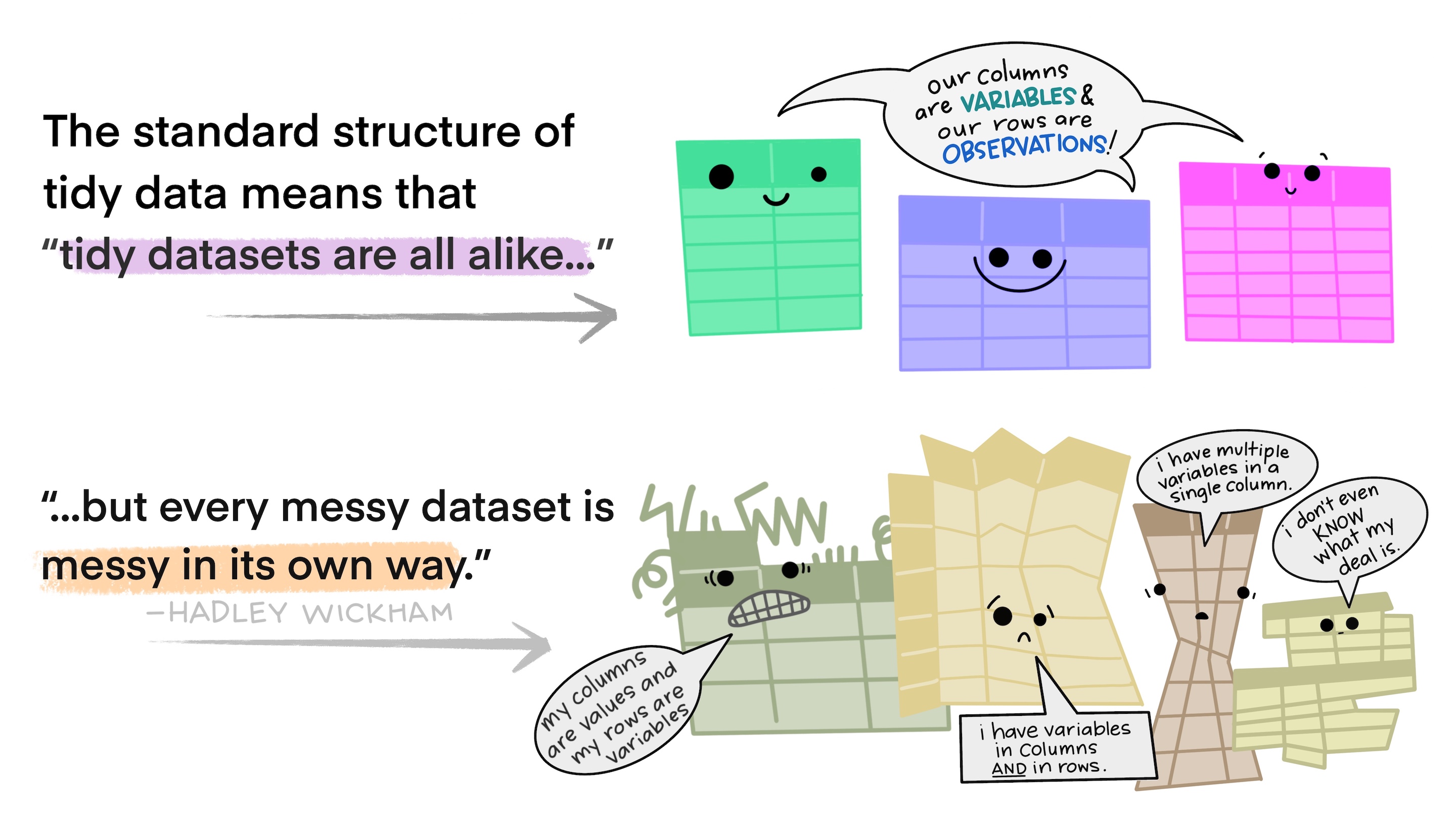
But the data you find in the wild is not always tidy.
The tidyverse group of packages collects the main workbench of functions you can use to clean, wrangle and manipulate your data.
The ultimate goal of tidy workflows is that you can turn any untidy dataset into a tidy one and then be able to apply reproducible workflows.

2.2.1 Tidyverse packages
![]()
![]()
![]()
![]()
![]()
![]()
![]()
![]()
2.2.2 A typical data analysis workflow
- Open a new QMD file in your course RStudio project
- Create a new code chunk and type the code below, you can use the keyboard shortcut
CTRL+ALT+I
# Call the tidyverse packages
library(tidyverse)
── Attaching core tidyverse packages ──────────────────────── tidyverse 2.0.0 ──
✔ dplyr 1.1.4 ✔ readr 2.1.5
✔ forcats 1.0.0 ✔ stringr 1.5.1
✔ ggplot2 3.5.1 ✔ tibble 3.2.1
✔ lubridate 1.9.3 ✔ tidyr 1.3.1
✔ purrr 1.0.2
── Conflicts ────────────────────────────────────────── tidyverse_conflicts() ──
✖ dplyr::filter() masks stats::filter()
✖ dplyr::lag() masks stats::lag()
ℹ Use the conflicted package (<http://conflicted.r-lib.org/>) to force all conflicts to become errors# Read data with {readr} (already loaded with the code above)
data = read_csv("https://raw.githubusercontent.com/loreabad6/app-dev-gis/main/data/data_lesson2.csv")Rows: 81344 Columns: 18
── Column specification ────────────────────────────────────────────────────────
Delimiter: ","
chr (14): ident, type, name, continent, iso_country, iso_region, municipalit...
dbl (4): id, latitude_deg, longitude_deg, elevation_ft
ℹ Use `spec()` to retrieve the full column specification for this data.
ℹ Specify the column types or set `show_col_types = FALSE` to quiet this message.- Explore your data with the function
glimpse(), what do you have? What is this data about? How many observations do you have? How many columns?
glimpse(data)Rows: 81,344
Columns: 18
$ id <dbl> 6523, 323361, 6524, 6525, 506791, 6526, 322127, 6527…
$ ident <chr> "00A", "00AA", "00AK", "00AL", "00AN", "00AR", "00AS…
$ type <chr> "heliport", "small_airport", "small_airport", "small…
$ name <chr> "Total RF Heliport", "Aero B Ranch Airport", "Lowell…
$ latitude_deg <dbl> 40.07099, 38.70402, 59.94773, 34.86480, 59.09329, 35…
$ longitude_deg <dbl> -74.93369, -101.47391, -151.69252, -86.77030, -156.4…
$ elevation_ft <dbl> 11, 3435, 450, 820, 80, 237, 1100, 3810, 3038, 87, 3…
$ continent <chr> NA, NA, NA, NA, NA, NA, NA, NA, NA, NA, NA, NA, NA, …
$ iso_country <chr> "US", "US", "US", "US", "US", "US", "US", "US", "US"…
$ iso_region <chr> "US-PA", "US-KS", "US-AK", "US-AL", "US-AK", "US-AR"…
$ municipality <chr> "Bensalem", "Leoti", "Anchor Point", "Harvest", "Kin…
$ scheduled_service <chr> "no", "no", "no", "no", "no", "no", "no", "no", "no"…
$ gps_code <chr> "K00A", "00AA", "00AK", "00AL", "00AN", NA, "00AS", …
$ iata_code <chr> NA, NA, NA, NA, NA, NA, NA, NA, NA, NA, NA, NA, NA, …
$ local_code <chr> "00A", "00AA", "00AK", "00AL", "00AN", NA, "00AS", "…
$ home_link <chr> "https://www.penndot.pa.gov/TravelInPA/airports-pa/P…
$ wikipedia_link <chr> NA, NA, NA, NA, NA, NA, NA, NA, "https://en.wikipedi…
$ keywords <chr> NA, NA, NA, NA, NA, "00AR", NA, NA, NA, NA, NA, "00C…- Some columns are not really so interesting, let’s get rid of them. Use the
select()function from the{dplyr}package to do so.
# To select a set of columns you can use the `c()` function
# To keep all the columns except a set you can use a `-` sign in front
# Remove the columns: wikipedia_link, keywords, continent, home_link
# by replacing the `...` below
# Remember to save your data, either overwriting it or creating a new object
# data = select(data, -c(wikipedia_link, keywords, continent, home_link))
# You can also use a pipe syntax `|>` to concatenate your functions
data = data |>
select(-c(wikipedia_link, keywords, continent, home_link))- Focus on a particular subset of your data. Can you filter the dataset (
filter()) to only show those in your home country? You will find the columniso_countrywith a ISO 3166 alpha-2 coding. If you don’t know the corresponding code, take a look at the Wikipedia link.
# In the `...` below you can add boolean comparisons per column,
# the function will check for each row if the comparison is
# true or false and will only keep the trues
data_ec = data |> filter(iso_country == "EC")- Now let’s take a look at the variable
type. It seems to have categorical information. We can do a check of its categories by calling theunique()function.
# The unique() function is from base R.
# You can use retrieval operators from base R to select the column you want to check
# You can also use functions from dplyr such as select() to select a column but keep the tibble structure and pull() to extract the column as a vector
unique(data_ec$type)
[1] "small_airport" "closed" "heliport" "medium_airport"
[5] "large_airport" - Can you find how many of these types are present in your country? You can use the function
count().
# In the count() function you can pass your column of interest
# and get a frequency table
# This is a convenience function to performing
# data |> group_by(type) |> summarise(n = n())
data_ec |> count(type)
# A tibble: 5 × 2
type n
<chr> <int>
1 closed 12
2 heliport 28
3 large_airport 2
4 medium_airport 14
5 small_airport 301- Shall we make a plot of that info? Let’s use
ggplot()functions to do that, in this case a bar plot would be a good fit.
# ggplot functions concatenate layers by using the `+` operator
# usually the data you want to plot is stated in the first line
# as the argument for ggplot()
ggplot(data_ec) +
# the next layer will be in this case the bar plot
# the aesthetics (aes()) are the ones that map information of the data
# source to the plot. Here you can pass the arguments a plot needs.
# whatever is not mapped to the dataset is passed outside of aes()
# you can see R color guides here: http://www.stat.columbia.edu/~tzheng/files/Rcolor.pdf
  geom_bar(aes(x = type), fill = "deepskyblue") +
  xlab("Airport type") +
  theme_bw()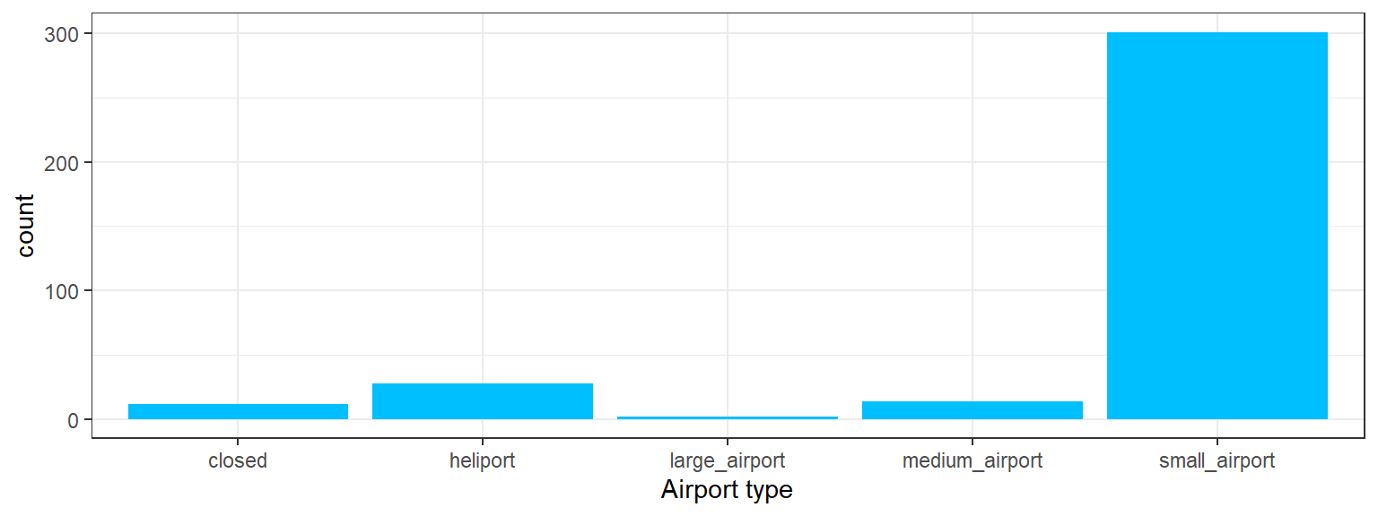
- You can go a step further and create subplots based on a variable of interest.
ggplot(data_ec) +
  geom_bar(aes(y = type), fill = "deepskyblue") +
  facet_wrap(~iso_region, ncol = 6) +
  ylab("Airport type") +
  theme_bw()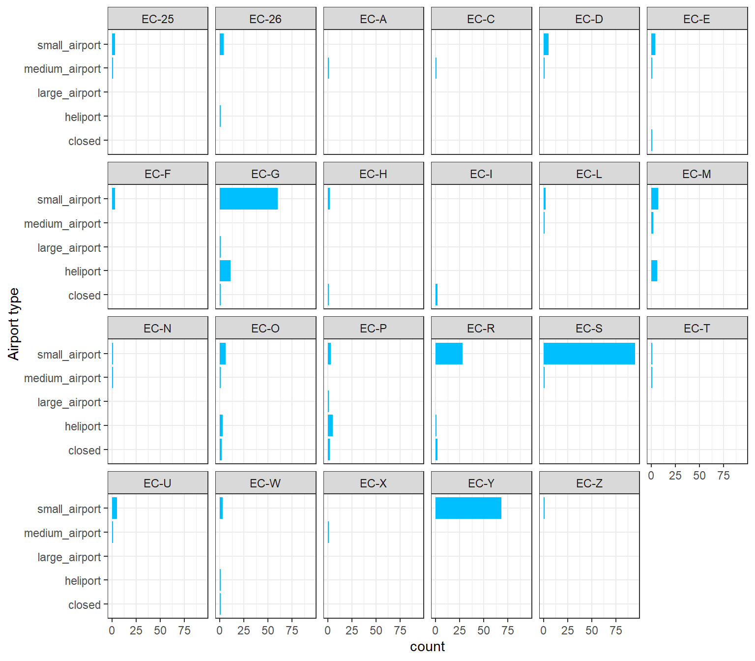
2.3 Spatial data
Spatial data is special, you already know this. Coordinates, projections and transformations, geometries, vector data types, raster and gridded data: these are a sample of the characteristics spatial software has to take into account.
Spatial data in R has had a long history and evolution. Spatial packages were developed already from the time R’s predecessor, the S language, was around in the 1990s. Many package developments have taken place until getting to the current state of R-Spatial packages. We will take a look at the current package ecosystem next session.
2.3.1 The {sf} package
Simple Features for R {sf} (E. Pebesma, 2018) is currently the main R package to handle spatial data. Simple features are a formal OGC standard (ISO 19125-1:2004) that describes how objects in the real world can be represented in computers.
Geometry types: points, lines, polygons, or their derivatives are represented by this OGC hierarchical data model. {sf} supports the following geometry types:
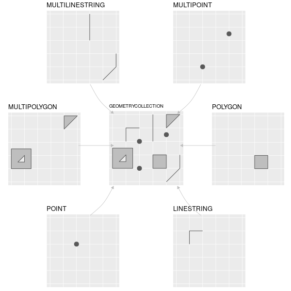
{sf} from Lovelace et al. (2019)The {sf} package was designed to fit tidy data workflows. To do so, it keeps the philosophy of one row per observation, one column per variable. As such, the geometry of each observation is treated as a variable and is place in a geometry column.
But the geometry column in a sf object is special in different ways:
- it is a “sticky” column, which means it is not easily dropped by any data operations you perform, e.g. when you select a column in a
sfobject, the geometry column will stay there. - it is a “list-column”, which means it is a nested column.
- it has its own class:
sfc, which is a standalone class where methods forsfcobjects can be applied.
sfc methods
library(sf)
methods(class = "sfc")
##  [1] [                            [<-
##  [3] as.data.frame                c
##  [5] coerce                       format
##  [7] fortify                      identify
##  [9] initialize                   obj_sum
## [11] Ops                          points
## [13] print                        rep
## [15] scale_type                   show
## [17] slotsFromS3                  st_area
## [19] st_as_binary                 st_as_grob
## [21] st_as_s2                     st_as_sf
## [23] st_as_text                   st_bbox
## [25] st_boundary                  st_break_antimeridian
## [27] st_buffer                    st_cast
## [29] st_centroid                  st_collection_extract
## [31] st_concave_hull              st_convex_hull
## [33] st_coordinates               st_crop
## [35] st_crs                       st_crs<-
## [37] st_difference                st_exterior_ring
## [39] st_geometry                  st_inscribed_circle
## [41] st_intersection              st_intersects
## [43] st_is                        st_is_full
## [45] st_is_valid                  st_line_merge
## [47] st_m_range                   st_make_valid
## [49] st_minimum_bounding_circle   st_minimum_rotated_rectangle
## [51] st_nearest_points            st_node
## [53] st_normalize                 st_point_on_surface
## [55] st_polygonize                st_precision
## [57] st_reverse                   st_sample
## [59] st_segmentize                st_set_precision
## [61] st_shift_longitude           st_simplify
## [63] st_snap                      st_sym_difference
## [65] st_transform                 st_triangulate
## [67] st_triangulate_constrained   st_union
## [69] st_voronoi                   st_wrap_dateline
## [71] st_write                     st_z_range
## [73] st_zm                        str
## [75] summary                      text
## [77] type_sum                     vec_cast.sfc
## [79] vec_ptype2.sfc
## see '?methods' for accessing help and source code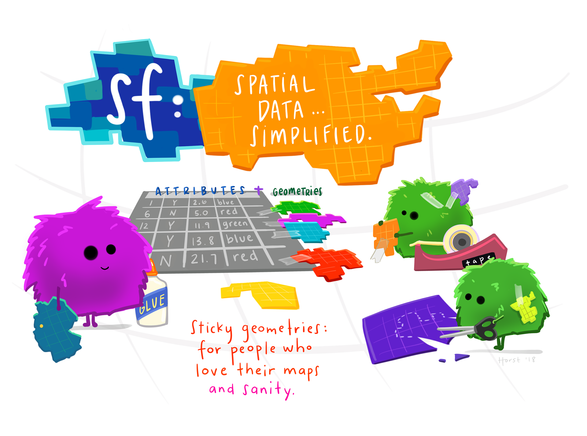
2.3.2 Turning X/Y data into a sf
- Convert your
dataobject to a spatial object. For this we will use thesfpackage.
# The `st_as_sf()` function is used to convert a foreign object into a sf object
# If you have a tabular dataset with X/Y or lat/long columns, this can be
# turned into a sf by passing it as a vector to the `coords` parameter
# Don't forget to also assign the correct `crs` to your object
data_sf = st_as_sf(
  data_ec,
  coords = c("longitude_deg", "latitude_deg"),
  crs = 4326 # this is the projection the data is in
)- Take a look at the new spatial object you created, how is it different from the tabular format we had before?
data_sfSimple feature collection with 357 features and 12 fields
Geometry type: POINT
Dimension: XY
Bounding box: xmin: -90.953 ymin: -4.37823 xmax: -75.39438 ymax: 1.264791
Geodetic CRS: WGS 84
# A tibble: 357 × 13
id ident type name elevation_ft iso_country iso_region municipality
* <dbl> <chr> <chr> <chr> <dbl> <chr> <chr> <chr>
1 41595 EC-0001 small_… Cara… 126 EC EC-O Carabon
2 308084 EC-0002 closed Seym… NA EC EC-W Isla Baltra
3 317181 EC-0003 closed Old … 170 EC EC-R Santa Rosa
4 323803 EC-0004 small_… Nuev… NA EC EC-D Nuevo Rocaf…
5 323805 EC-0005 small_… Loro… 630 EC EC-Y Lorocachi
6 323806 EC-0006 small_… Pava… NA EC EC-Y Pavacachi
7 323808 EC-0007 small_… Jaim… 849 EC EC-Y Quilloalpa
8 323809 EC-0008 small_… Tara… NA EC EC-Y Taracoa
9 323810 EC-0009 small_… Yuca… NA EC EC-Y <NA>
10 323811 EC-0010 small_… Paca… NA EC EC-Y Pacayacu
# ℹ 347 more rows
# ℹ 5 more variables: scheduled_service <chr>, gps_code <chr>, iata_code <chr>,
# local_code <chr>, geometry <POINT [°]>- We can have a quick visual of the dataset now that we have given it coordinates. You can use the base R function
plot()for this.
# This function will plot the first 9 parameters of the sf object,
# unless specified otherwise
# This might take a bit depending on how good your computer is,
# as we are plotting 80 thousand points ;)
plot(data_sf)
Warning: plotting the first 10 out of 12 attributes; use max.plot = 12 to plot
all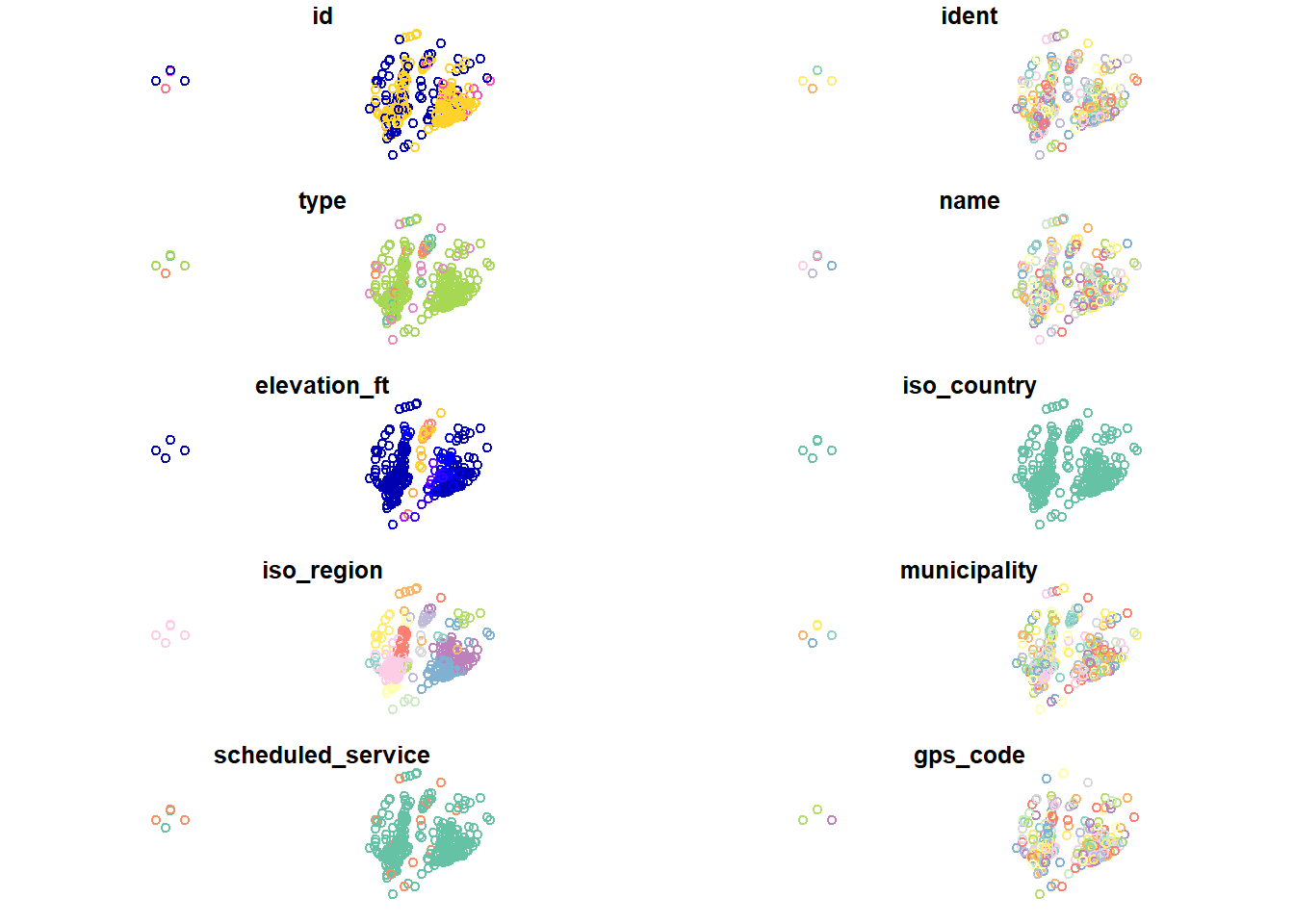
# You can also create a quick interactive map
library(mapview)
mapview(data_sf)- But this basic plot is not really a map just yet. Let’s make a map again for the airports in your home country. You will need to filter the data again, which is something you can do also in
sfobjects.
# We can use ggplot again to create a map! Here the `geom_sf()` function will be of use
ggplot(data_sf) +
  geom_sf(aes(color = type)) +
  # to do projections on the fly
  coord_sf(crs = 24817)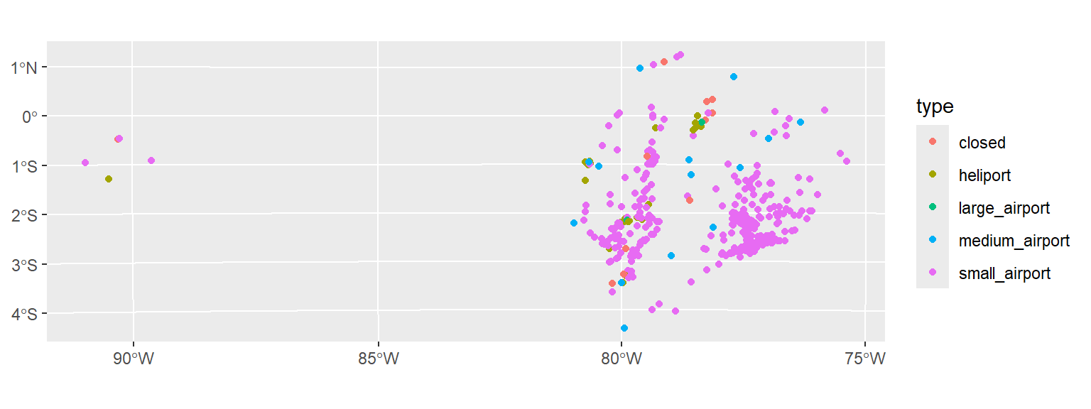
- One extra feature we can add is a country base layer to help locate the information. For this we can use the
rnaturalearthpackage.
library(rnaturalearth)
# You can add the name of your country
country = ne_countries(scale = 50, country = "Ecuador")- Here we plot both layers in one map
# Here we will call the ggplot function again but with different spatial layers
# Since we want to have the country boundary in the background
# we will call that function first and then the data object we filtered above
ggplot() +
  geom_sf(data = country) +
  geom_sf(data = data_sf, aes(color = type)) +
  coord_sf(crs = 24817)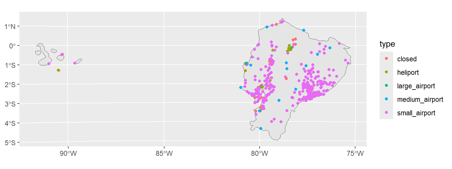
- Customise your map, play a bit with the options you have. It makes sense you are not familiar with everything but you can start exploring. I customised my map you can see the full code to create it in the next section.
2.3.3 A customised map
Full code for a more customised map
library(tidyverse)
library(sf)
library(rnaturalearth)
# Read in the data
data = read_csv("https://raw.githubusercontent.com/loreabad6/app-dev-gis/main/data/data_lesson2.csv")
data_sf_ec = data |>
  # Directly transform to sf
  st_as_sf(coords = c("longitude_deg", "latitude_deg"), crs = 4326) |>
  # Filter for my home country
  filter(iso_country == "EC") |>
  # Transform airport type to nice labels by capitalising the first letter and removing the snakecase
  mutate(type = str_to_sentence(str_replace_all(type, "_", " "))) |>
  # Relevel or reorder the types to have them in a more logical order
  mutate(type = fct_relevel(type, "Large airport", "Medium airport",
                            "Small airport", "Heliport", "Closed"))
# Obtain Ecuador but also surrounding countries for context
countries = ne_countries(scale = 50, country = c("Colombia","Ecuador","Peru"))
# Extract Ecuador to obtain its bounding box and focus on it in coord_sf
ecuador = countries |> filter(sovereignt == "Ecuador")
ec_bbox = ecuador |>
  # Transform before getting the bounding box to match the CRS in the plot
  st_transform(24817) |> st_bbox()

ggplot() +
  # add the country layer
  geom_sf(data = countries, fill = "grey90", color = "white") +
  # add the data, changed the shape to a dot with a fill and border color,
  # assgined an alpha or opacity to not oclude the points
  geom_sf(data = data_sf_ec, aes(fill = type, size = type),
          shape = 21, alpha = 0.8) +
  # Change the fill palette
  scale_fill_brewer("Airport type", palette = "Dark2") +
  # Manually assign point sizes
  scale_size_manual("Airport type", values = c(6, 4, 2, 1, 0.25)) +
  # Change the CRS to a projected one to avoid distorsions.
  # Focus the map on Ecuador by using the bounding box extent
  coord_sf(
    crs = 24817,
    xlim = c(ec_bbox["xmin"], ec_bbox["xmax"]),
    ylim = c(ec_bbox["ymin"], ec_bbox["ymax"])
  ) +
  # use a more minimal theme
  theme_bw() +
  # change the legend to the bottom
  theme(legend.position = "bottom")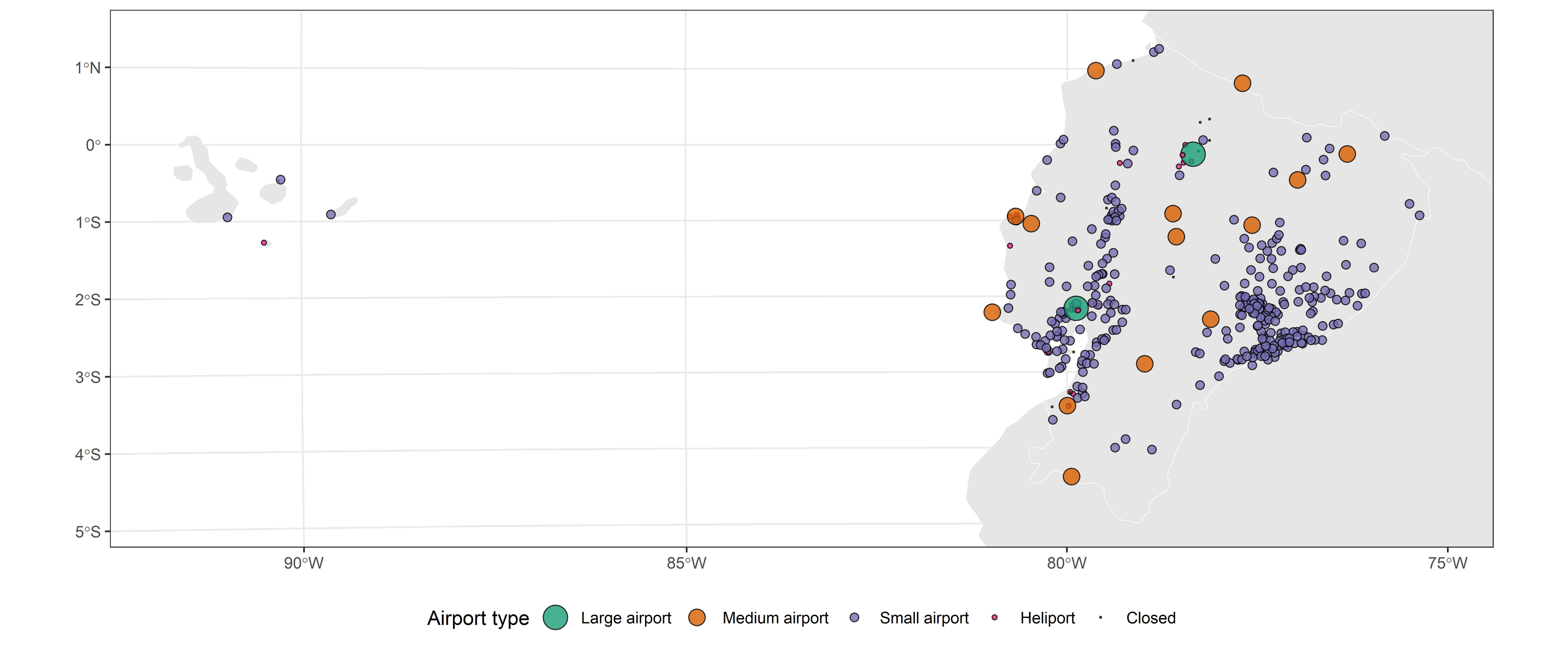
… you know, if you are bored.

You can keep playing with your map to get familiar with the ggplot package, customise it further, add scale and north arrows… your imagination (and maybe the ggplot extensions available) is the limit.
Another thing you can try is to create a function that automatically generates the map for a given country.
2.4 Further reading:
- Data import chapter (Wickham, Çetinkaya-Rundel, et al., 2023)
- Tidy data chapter (Wickham, Çetinkaya-Rundel, et al., 2023)
- History of R-Spatial section (Lovelace et al., 2019)
- Spatial data section, chapters 1-6 (E. Pebesma & Bivand, 2023)
- Geographic Data in R chapter (Lovelace et al., 2019)
- Simple Features for R vignette (E. Pebesma, 2025)